But 40% of your traffic bounces before checkout.
Here’s the thing about growth hacks they’re not about getting more visitors. They’re about fixing the leaks that are already killing your conversion rate.
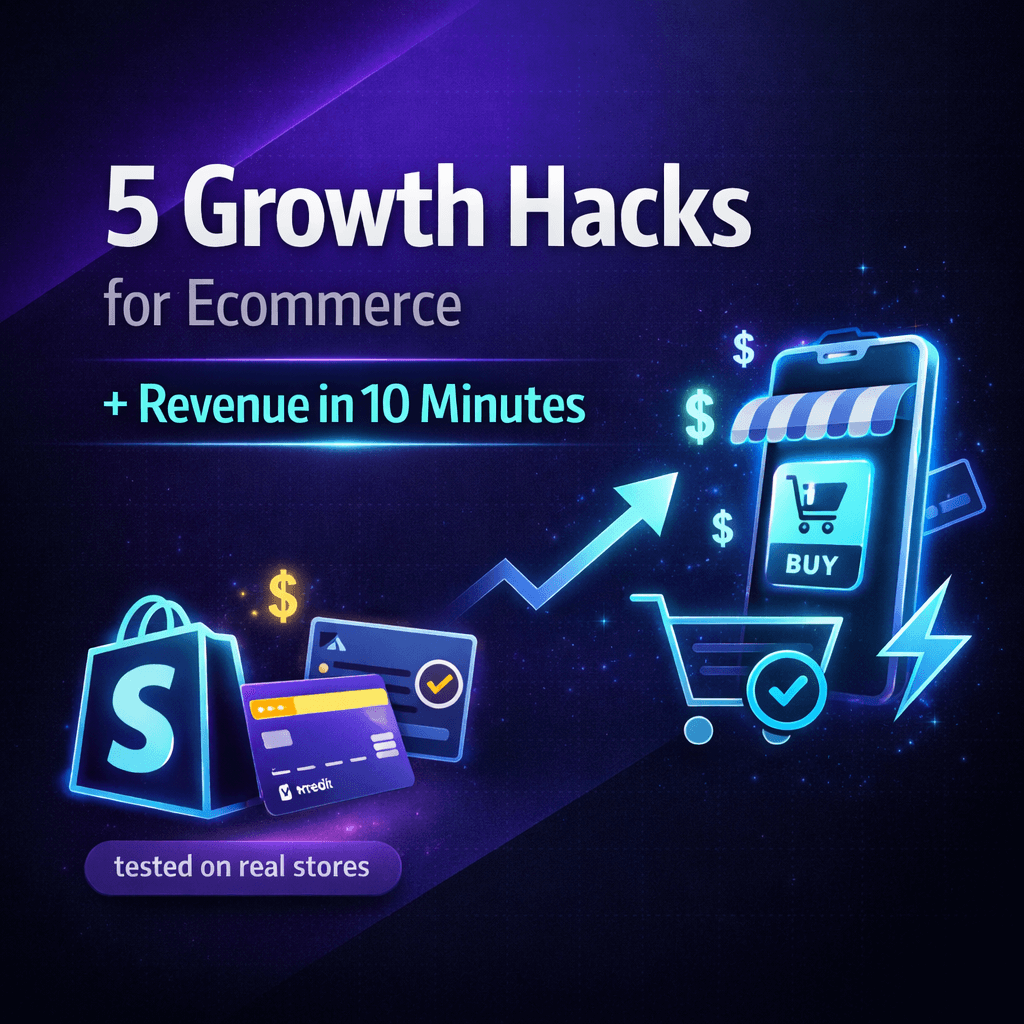
I’m going to show you 5 tactics we use with skincare and wellness brands. Each one takes less than 30 minutes to deploy. No developer needed. No complex integrations.
We’ve tested these on real Shopify stores doing $500k-$5M annually. Every hack comes with proof, real examples, and the exact steps to implement it today.
Why Most Growth Hacks Don’t Work for Skincare Brands
Most growth hack articles are written by people who’ve never run a DTC brand.
They don’t get that skincare customers visit 5-7 times before buying a $60 serum. They don’t understand Shopify’s limitations. And they definitely haven’t tried implementing their own advice on mobile.
If something takes 3 weeks to build, it’s not a hack. It’s a project.
This post is different. We’ve actually done this with real brands. Everything here takes 10-30 minutes max. No theory. Just what actually converts.
The 5-Hack Framework (And Why Each One Matters)
Think of your funnel like a bucket with holes. Each hack plugs a different leak:
Hack #1: Show them proof up front (builds instant trust)
Hack #2: Make the next step obvious (removes friction)
Hack #3: Ask for less information (stops form abandonment)
Hack #4: Tell them what they’ll get (cuts decision time)
Hack #5: Show them others like them (kills last-minute doubt)
Do all 5 and you’ve covered their entire journey from landing on your site to hitting purchase.
Hack #1: Hero Section with Product-in-Use + Proof
What This Means
Stop using those pristine product shots on white backgrounds. Show real people using your stuff.
Why Skincare Brands Need This
When someone lands on your serum page, they’re not wondering what the bottle looks like. They’re wondering: “Will this actually work for my skin?”
A marble countertop with perfect lighting doesn’t answer that question.
A customer applying the serum with visible results? That does.
How to Actually Do This on Shopify
Step 1: Ask a happy customer for a photo or video (offer them $25 off or a free product)
Step 2: Open your Shopify theme editor and swap out the hero image
Step 3: Clean up everything else—one headline, one button, one visual
Step 4: Make sure your “Shop Now” button shows without scrolling
Takes about: 10 minutes
Real Example from a Skincare Brand
What they had: Serum bottle on white marble with tiny ingredient callouts
What we changed it to: Customer applying vitamin C serum, with a before/after showing brighter skin
What happened: People could immediately see it works on actual skin, not just in a lab.
Why This Works
We’ve tested this across multiple brands:
- Real usage beats product shots every time
- Keep it simple too many elements just confuse people
- Put your main button where they can see it immediately
Don’t Do This
Don’t cram 5 testimonials into your hero. Don’t use massive video files that take forever to load. And don’t hide your call-to-action below the fold where nobody sees it.
Hack #2: CTAs People Actually Want to Click
What This Is
Change those boring “Submit” and “Buy Now” buttons to something that actually sounds appealing.
Why This Matters for Wellness Brands
“Submit” sounds like you’re filling out a tax form.
“Start My 30-Day Glow Routine” sounds like you’re starting a transformation.
People don’t want to feel like they’re buying something. They want to feel like they’re beginning something that’ll improve their life.
How to Fix This in 5 Minutes
Step 1: Look at every button on your site product pages, checkout, email signup, everywhere
Step 2: Replace generic language with specific outcomes
Step 3: Use “my” instead of “your” (makes it feel personal)
Step 4: Make sure it’s visible test the color and size on mobile
Takes: 5 minutes per page
Before and After Examples
| Where It Shows Up | Generic Version | Better Version |
|---|---|---|
| Serum page | “Add to Cart” | “Start My Glow Routine” |
| Supplement page | “Buy Now” | “Begin My 30-Day Supply” |
| Email signup | “Subscribe” | “Send Me Skincare Tips” |
| Checkout | “Submit Order” | “Complete My Order” |
| Quiz page | “Take Quiz” | “Find My Perfect Serum” |
What Makes These Work
Based on what we’ve tested:
- They stand out visually (color contrast matters)
- They sound like an action you’d actually want to take
- They don’t make you feel like you’re committing to something scary
Skip These Mistakes
“Click here” tells people nothing. “Learn More” is so vague it’s meaningless. And putting 3 different buttons on one screen just confuses everyone.
Hack #3: Forms That Don’t Make People Give Up
What We’re Talking About
Cut your forms down to 2-3 fields. That’s it. Every extra field you remove gets you more completions.
Why Skincare Shoppers Abandon Forms
Your customer is on her phone, comparing 4 different retinol serums in different tabs.
She finds your email signup. It asks for her name, email, phone, age, skin type, and how she heard about you.
She closes the tab.
Make it just name and email? She converts.
How to Fix Your Shopify Forms
Step 1: Find every form on your site (checkout, email capture, account creation, that skin quiz)
Step 2: Delete anything you don’t absolutely need to send them the product or content
Step 3: Turn on Shopify’s autofill for checkout
Step 4: Add a “We never spam” note or a security badge
Takes: 10 minutes per form
Real Examples from Wellness Brands
Skin quiz signup:
Had: Name, email, phone, age, skin concerns, referral source
Now: Just email (we ask about skin in the actual quiz)
Supplement checkout:
Had: 12 fields including company, phone, second address line
Now: 8 fields (removed phone, use Shopify’s address lookup)
Free sample:
Had: 5 fields
Now: 3 fields (email, first name, address)
What Usually Happens
| Form Type | Started With | Cut Down To | Result |
|---|---|---|---|
| Email signup | 6 fields | 2 fields | 40% more people finish |
| Checkout | 12 fields | 8 fields | 15% fewer abandonments |
| Skin quiz | 8 upfront questions | 3 fields then quiz | 50% more people start |
What We’ve Learned
Forms that convert:
- Only ask for what you actually need
- Show trust signals (that little lock icon helps)
- Let people autofill instead of typing everything
Avoid This
Don’t ask for phone numbers unless you’re actually going to call. Don’t make fields look required when they’re optional. And don’t create forms taller than a phone screen.
Hack #4: Headlines That Tell People What They’ll Actually Get
What This Hack Does
Rewrite your headlines so people immediately know if your product is for them and what it’ll do.
Why This Helps Your SEO Too
People decide in about 3 seconds whether your page is relevant.
“Retinol Night Serum” doesn’t help them decide anything.
“Clear, firm skin in 30 days for sensitive, aging skin” tells them exactly whether this is their solution.
Bonus: Google also understands your page better. Instead of ranking for generic “retinol serum,” you rank for “best retinol for sensitive skin.”
How to Rewrite Your Headlines
Step 1: Look at your homepage, product pages, collection pages, landing pages
Step 2: Use this formula: “[What they’ll get] in [how long] for [who they are]”
Step 3: Talk about outcomes, not ingredient lists
Step 4: If you get decent traffic, A/B test it
Takes: 5 minutes per headline
Skincare and Supplement Examples
Vitamin C serum:
Before: “Vitamin C Serum with Hyaluronic Acid and Ferulic Acid”
After: “Bright, even skin tone in 21 days for dull, sun-damaged skin”
Collagen supplement:
Before: “Premium Marine Collagen Peptides 10g”
After: “Firm skin and strong joints in 60 days for women over 40”
Homepage:
Before: “Clean, Science-Backed Skincare”
After: “Clinically proven results in 30 days or full refund”
Quick Quality Check
Is it obvious who this is for?
Does it promise something specific and measurable?
Is it short enough to read on mobile (under 12 words)?
Does it avoid jargon only industry people understand?
What Makes Headlines Work
Good headlines:
- Talk directly to your ideal customer
- Get the point across in under 5 seconds
- Focus on what changes, not what’s inside the bottle
Don’t Do This
Don’t lead with ingredients (“Contains ceramides and peptides”). Don’t make it about your brand (“We believe in clean beauty”). And don’t promise vague feelings (“Feel beautiful today”).
Hack #5: Social Proof That Actually Builds Trust
What This Means
Show real customer photos, real names, and specific results right where people are deciding whether to buy.
Why Skincare Needs Specific Proof
Generic 5-star ratings don’t convince anyone to buy a $75 serum or commit to a $60/month supplement subscription.
You know what does? Specifics.
“Sarah M. cleared her hormonal acne in 14 days” with an actual photo beats “Love this!  ” every single time.
How to Add This to Your Shopify Store
Step 1: Get customer photos, videos, or detailed reviews (bribe them with discounts if you need to)
Step 2: Put this proof right next to your “Add to Cart” button, on the checkout page, everywhere someone’s about to decide
Step 3: Real names, real photos, specific wins—not just star ratings
Step 4: Update it monthly with fresh content
Takes: 10 minutes for the first one
Real Brand Examples
Serum product page (right above the buy button):
Customer photo showing before/after + quote:
“I’ve had cystic acne for 10 years. This cleared my skin in 14 days and didn’t irritate at all. — Sarah M., verified buyer”
Supplement checkout:
“Join 8,400+ customers who’ve seen results in 30 days”
After they buy:
Email with Instagram gallery showing 6 customers using your products
Collection page:
“2,100 orders shipped this week” or rotating video testimonials
What We’ve Seen Work
Social proof that converts:
- Real customer photos (people can spot stock images instantly)
- Builds trust right when they’re deciding
- Addresses their specific worry (“Will this work for sensitive skin?”)
Major Mistakes
Don’t use stock photos and pretend they’re customers—people know. Don’t show generic praise with zero context. And don’t hide all your reviews on some separate page nobody visits.
What You Can Do Right Now (30 Minutes Total)
Here’s your action list for today:
Task 1: Swap your homepage hero image for a customer using your product (10 min)
Task 2: Rewrite your 3 main buttons with better copy (5 min)
Task 3: Delete 2 unnecessary fields from your email form or checkout (10 min)
Task 4: Fix your best-seller’s headline to promise an outcome (5 min)
Task 5: Add one customer photo and quote near your main buy button (10 min)
Total: 40 minutes
What to expect: 5-10% better conversion rate within a week or two (that’s what we typically see with skincare and supplement brands)
Your 14-Day Testing Plan
Here’s how to roll this out over 2 weeks:
Week 1: Make the Changes
Day 1-2: Fix your homepage (hero, headline, button)
Day 3-4: Update your top 3 product pages (images, buttons, proof)
Day 5-6: Clean up checkout and forms (fewer fields, trust badges)
Day 7: Fix email templates and landing pages
Week 2: Watch What Happens
Check these numbers every day:
- Conversion rate (visitors who actually buy)
- How many people add to cart
- How many abandon checkout
- How many people sign up for email
- Bounce rate on your main pages
What Good Looks Like
5-15% better conversions after 2 weeks is pretty normal when you do all 5 hacks.
10-20% fewer people abandoning checkout when you fix the forms.
30-50% more email signups when you drop to 2 fields.
Want Someone to Do This for You?
This is literally what we do in our 14-Day Revenue Rescue Sprint for skincare and wellness brands.
We make these 5 changes on your Shopify store, watch the numbers every day, and keep tweaking until we hit your goals.
Check out our recent work with DTC brands.
Mistakes That’ll Kill Your Results
Mistake 1: Changing Everything at Once
You won’t know what actually worked.
Fix it: Do one thing per page or one thing per week. Track each change separately.
Mistake 2: Faking Your Social Proof
Stock photos or made-up customer names destroy trust way faster than having no proof at all.
Fix it: Use real content or skip it entirely. Never fake it.
Mistake 3: Only Fixing the Words
Button copy matters. But so does color, size, where you put it, how much space is around it.
Fix it: Test everything together. Use heat maps if you have them.
Mistake 4: Adding Fields Back Later “Just to Be Safe”
If you’re not using the data, don’t ask for it.
Fix it: Start with fewer fields. You can always add one back if you prove you actually need it.
Mistake 5: Writing for Your Brand Instead of Your Customer
“We create science-backed skincare” doesn’t help anyone.
Fix it: Flip it around. “Clinically proven clear skin in 30 days” talks to what they actually want.
“Yeah But…” (Answering Your Objections)
We can’t afford CRO work right now.
These cost nothing. You’re literally just swapping an image, changing some words, and deleting form fields.
No tools to buy. No freelancers to hire. Zero subscriptions.
We don’t have a developer.
You don’t need one. Shopify’s theme editor does all of this. If you can upload a product photo, you can do everything on this list.
What if this doesn’t work for our customers?
Test one thing on one page. Check your numbers after a week. If nothing changed, just change it back.
You’ve risked 10 minutes. But if it works, you’re looking at 10-20% more revenue from the same traffic.
Our site’s already optimized though.”
Open your site right now. Look at your buttons. Do any say “Submit”? Is your hero section a product shot or a real customer? Does your checkout have 8+ fields?
If you answered yes to any of those, you’ve got room to improve.
Questions We Get All the Time
Q: How fast will I see results?
Most skincare and wellness brands see something change within 7-14 days. Just track your Shopify conversion rate and checkout abandonment every week.
Q: Should I do all 5 at once or one at a time?
If you get 1,000+ visitors a week, do all 5 and watch overall numbers. Less traffic than that? Do one per week so you know what moved the needle.
Q: Does this work on mobile?
Especially on mobile. Over 70% of skincare traffic is mobile. Simple buttons, short forms, clear headlines all of that helps way more on phones.
Q: I don’t have customer photos or videos yet.
Offer 15% off or a free sample for UGC. Ask on Instagram Stories for people to tag your product. Give loyalty points for reviews with photos.
Q: Where should I start?
Your highest-traffic page. Usually homepage or your best-seller. Start with hack #1 (the hero section) or hack #2 (the buttons).
Q: Will this work if we’re still pretty new and don’t have much traffic?
Yeah, conversion optimization works at any size. You might just need 2-4 weeks of data to see the pattern if you’re under 500 visitors a week.
Q: Do I need Google Analytics or some paid tool?
Shopify shows you conversion rate and cart abandonment. That’s enough to start. Add Google Analytics later if you want more detail.
Q: Our theme doesn’t support video in the hero.
Use a really good static image of someone using the product. Or upgrade to a modern theme (Dawn, Impulse, Prestige all do video).
Q: Can I A/B test instead of just making the changes?
If you’re getting 500+ visitors per page per week, yeah. Use Shopify’s built-in experiments or Google Optimize (it’s free).
Q: How often should I update the photos and quotes?
Update hero content and testimonials monthly with new customer content. Headlines and buttons can stay the same unless your numbers drop.
Alright, Here’s What to Do Next
Pick one thing from this list.
Do it in the next 30 minutes.
Check your conversion rate in 7 days.
That’s it.
If you want help doing all 5 in the next 14 days with a team that’s done this for dozens of skincare and wellness brands doing $500k-$5M we can help.
Or ask about our 14-Day Revenue Rescue Sprint where we do exactly this on your store, track everything daily, and keep iterating until the numbers move.
One last question for you:
Which product page would convert 20% more if the hero showed real customer results instead of just a product photo?